pacman::p_load(sf, terra, spatstat,
               tmap, rvest, tidyverse,
ggthemes, plotly)In-class Exercise 3a: Interactive K-function
childcare_sf <- read_rds("data/rds/childcare_sf.rds") childcare_ppp <- as.ppp(childcare_sf) %>%
rjitter(retry = TRUE,
nsim = 1,
drop = TRUE)pg <- mpsz_cl %>%
filter(PLN_AREA_N == "PUNGGOL")
tm <- mpsz_cl %>%
filter(PLN_AREA_N == "TAMPINES")
ck <- mpsz_cl %>%
filter(PLN_AREA_N == "CHOA CHU KANG")
jw <- mpsz_cl %>%
filter(PLN_AREA_N == "JURONG WEST")pg_owin = as.owin(pg)
tm_owin = as.owin(tm)
ck_owin = as.owin(ck)
jw_owin = as.owin(jw)childcare_pg_ppp = childcare_ppp[pg_owin]
childcare_tm_ppp = childcare_ppp[tm_owin]
childcare_ck_ppp = childcare_ppp[ck_owin]
childcare_jw_ppp = childcare_ppp[jw_owin]Tampines planning area
Computing L-fucntion estimate
L_tm = Lest(childcare_tm_ppp, correction = "Ripley")
plot(L_tm, . -r ~ r,
     ylab= "L(d)-r", xlab = "d(m)",
     xlim=c(0,1000))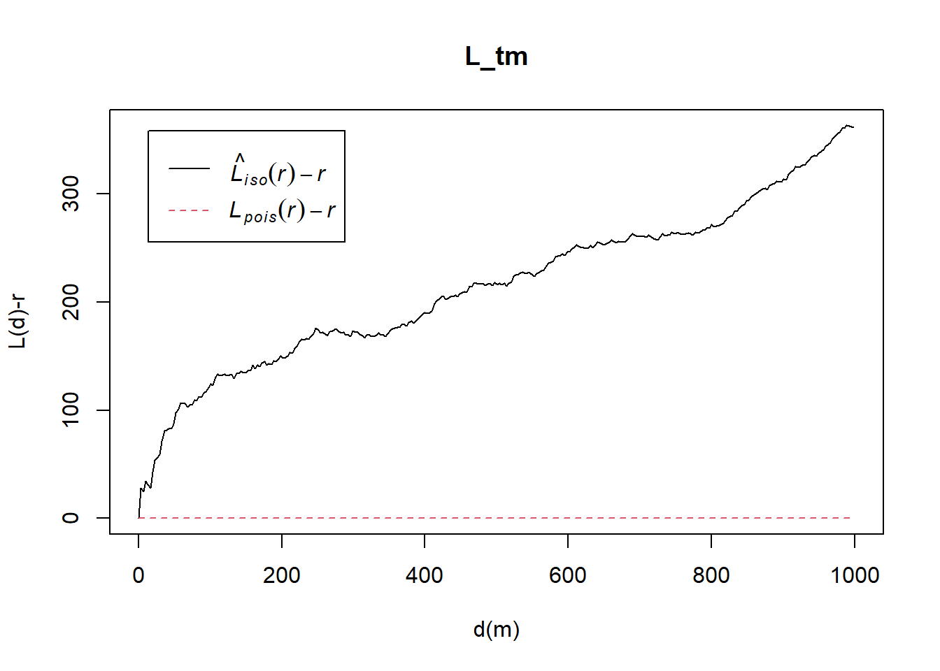
set.seed(1234)
L_tm.csr <- envelope(childcare_tm_ppp, Lest,
                     nsim = 99,
                     rank = 1,
                     glocal=TRUE)
Generating 99 simulations of CSR ...
1, 2, 3, 4, 5, 6, 7, 8, 9, 10, 11, 12, 13, 14, 15, 16, 17, 18, 19, 20,
21, 22, 23, 24, 25, 26, 27, 28, 29, 30, 31, 32, 33, 34, 35, 36, 37, 38, 39, 40,
41, 42, 43, 44, 45, 46, 47, 48, 49, 50, 51, 52, 53, 54, 55, 56, 57, 58, 59, 60,
61, 62, 63, 64, 65, 66, 67, 68, 69, 70, 71, 72, 73, 74, 75, 76, 77, 78, 79, 80,
81, 82, 83, 84, 85, 86, 87, 88, 89, 90, 91, 92, 93, 94, 95, 96, 97, 98,
99.
Done.Then, plot the model output by using the code chunk below.
plot(L_tm.csr, . - r ~ r,
     xlab="d", ylab="L(d)-r", xlim=c(0,500))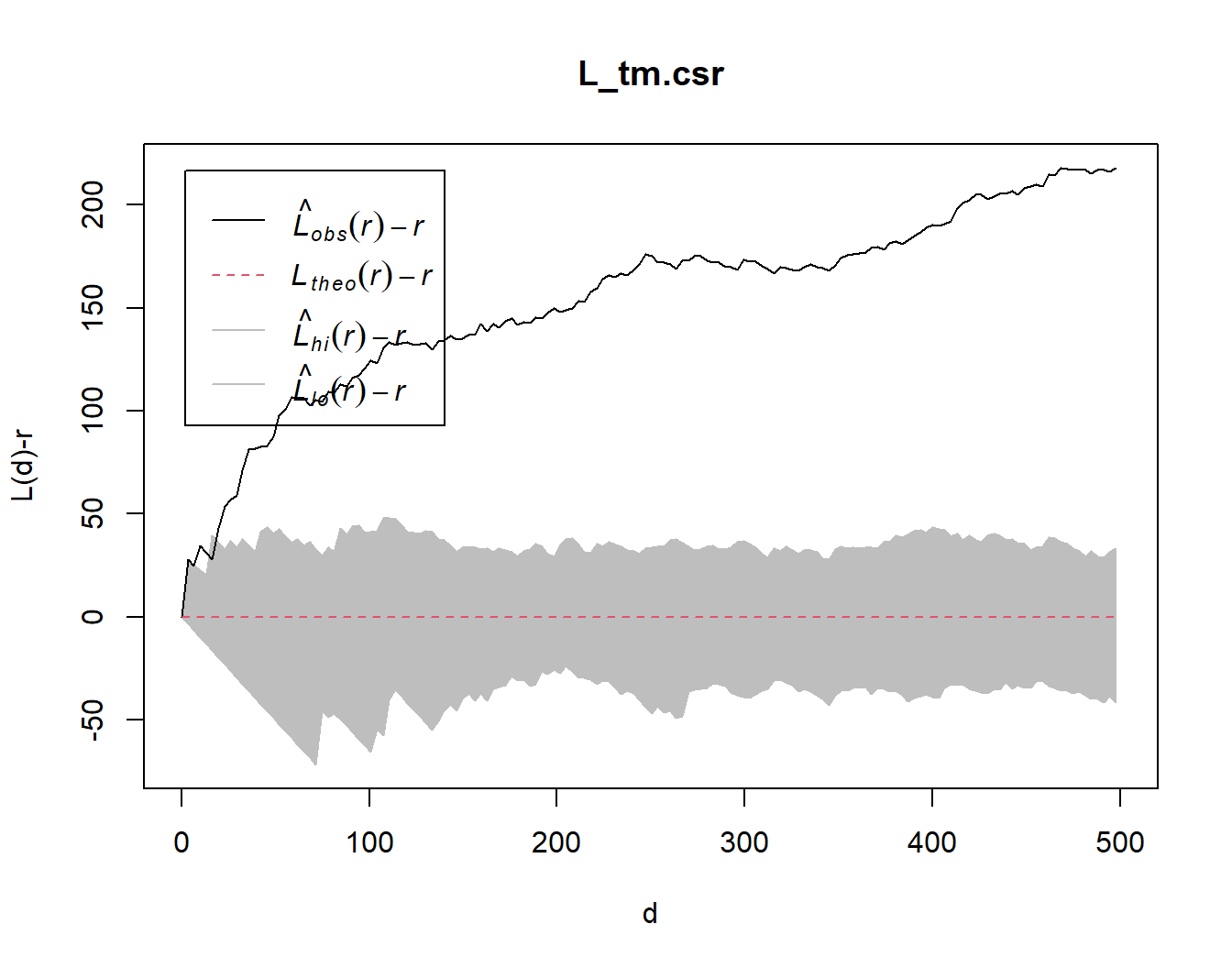
Building an interative plot with ggplotly
The previous code chunks uses plot() to visualise the envelopes of the second-order summary statistics (such as L-function). The output is a static plot, therefore it can be difficult to make accurate guesstimates of the statistics and the corresponding distance, r.
The below code chunk converts the output (which is in a list form) into a dataframe, which can be used to generate a similar plot using appropriate aesthetic mappings from ggplot package. Finally, ggplotly() is used to convert the ggplot into an interactive plotly visualisation.
The codes were referenced from a R-blogger article. Further modifications were made to enhance the user experience by customizing the tooltips for greater clarity and intuition.
title <- "Pairwise Distance: L function"

Lcsr_df <- as.data.frame(L_tm.csr)

colour=c("#0D657D","#ee770d","#D3D3D3")
csr_plot <- ggplot(Lcsr_df, aes(r, obs-r))+
  # plot observed value
  geom_line(colour=c("#4d4d4d"))+
  geom_line(aes(r,theo-r), colour="red", linetype = "dashed")+
  # plot simulation envelopes
  geom_ribbon(aes(ymin=lo-r,ymax=hi-r),alpha=0.1, colour=c("#91bfdb")) +
  xlab("Distance r (m)") +
  ylab("L(r)-r") +
  geom_rug(data=Lcsr_df[Lcsr_df$obs > Lcsr_df$hi,], sides="b", colour=colour[1])  +
  geom_rug(data=Lcsr_df[Lcsr_df$obs < Lcsr_df$lo,], sides="b", colour=colour[2]) +
  geom_rug(data=Lcsr_df[Lcsr_df$obs >= Lcsr_df$lo & Lcsr_df$obs <= Lcsr_df$hi,], sides="b", color=colour[3]) +
  theme_tufte()+
  ggtitle(title)

text1<-"Significant clustering"
text2<-"Significant segregation"
text3<-"Not significant clustering/segregation"

# the below conditional statement is required to ensure that the labels (text1/2/3) are assigned to the correct traces
if (nrow(Lcsr_df[Lcsr_df$obs > Lcsr_df$hi,])==0){
  if (nrow(Lcsr_df[Lcsr_df$obs < Lcsr_df$lo,])==0){
    ggplotly(csr_plot, dynamicTicks=T) %>%
      style(text = text3, traces = 4) %>%
      rangeslider()
  }else if (nrow(Lcsr_df[Lcsr_df$obs >= Lcsr_df$lo & Lcsr_df$obs <= Lcsr_df$hi,])==0){
    ggplotly(csr_plot, dynamicTicks=T) %>%
      style(text = text2, traces = 4) %>%
      rangeslider()
  }else {
    ggplotly(csr_plot, dynamicTicks=T) %>%
      style(text = text2, traces = 4) %>%
      style(text = text3, traces = 5) %>%
      rangeslider()
  }
} else if (nrow(Lcsr_df[Lcsr_df$obs < Lcsr_df$lo,])==0){
  if (nrow(Lcsr_df[Lcsr_df$obs >= Lcsr_df$lo & Lcsr_df$obs <= Lcsr_df$hi,])==0){
    ggplotly(csr_plot, dynamicTicks=T) %>%
      style(text = text1, traces = 4) %>%
      rangeslider()
  } else{
    ggplotly(csr_plot, dynamicTicks=T) %>%
      style(text = text1, traces = 4) %>%
      style(text = text3, traces = 5) %>%
      rangeslider()
  }
} else{
  ggplotly(csr_plot, dynamicTicks=T) %>%
    style(text = text1, traces = 4) %>%
    style(text = text2, traces = 5) %>%
    style(text = text3, traces = 6) %>%
    rangeslider()
  }
Note
The main features of the above visualisation:
- The observed and theoretical values of L(r)-r (including the upper and lower curves of the simulated envelope) can be found in the tooltip upon hovering the cursor over the geometry layers.
- The range slider below the plot enables users to pan and zoom in to a specific range of distance.
- The colored bands at the bottom of the line graph gives a clearer indication of significant or insignificant spatial segregation/ clustering at distance r. Dark green bands indicate significant clustering, orange indicate significant segregation, while grey indicates insignificant clustering/segregation.
- Tooltips were added to provide color legend information.